Text logos from your business name
Type a name and see it set as a wordmark: type only, no symbol, in fonts picked to suit it.
Free. No sign-up. PNG and SVG.
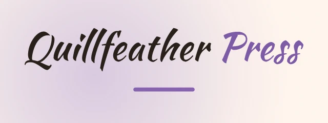
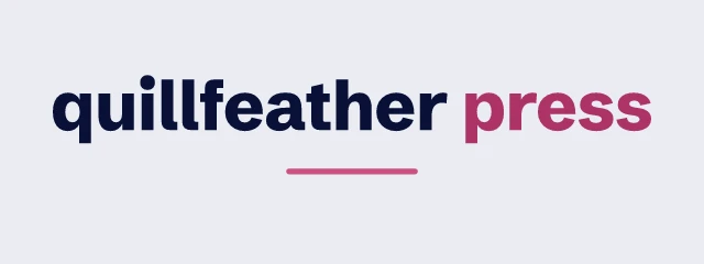
A wordmark is the name, drawn well
A text logo, also called a wordmark, has no symbol. The name is the whole design, so the choice of typeface, the case and the colour do all the work. Logo Lava sets layout=wordmark for every card above and decides the rest from the name itself: how long it is, what tone it suggests, and whether it reads as a person, a place or a product.
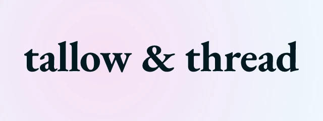
These examples use invented businesses. Each card opens in the logo maker, where you can swap the font, change the colours and download the file.
 Edit and download
EB Garamond 700, wordmark, soft background, none 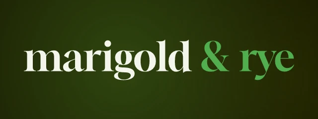 Edit and download
Gloock 400, wordmark, soft background, none  Edit and download
Lora 700, wordmark, soft background, none  Edit and download
Unbounded 800, wordmark, gradient background, none  Edit and download
JetBrains Mono 800, wordmark, soft background, none  Edit and download
Inter 500, wordmark, radial background, none  Edit and download
Red Hat Display 500, wordmark, soft background, none  Edit and download
Great Vibes 400, wordmark, solid background, none
How the font is chosen
Logo Lava keeps 211 fonts from 134 families, sorted into eight categories: geometric, neo, rounded, serif, slab, display, script and mono. For each name it scores every family. A category starts with a base weight, then gains points when it matches the tones the name suggests: serifs lean toward elegant, luxury and vintage, rounded faces toward friendly and playful, mono toward tech. The seed then draws one family from that weighted list, so the same name gives many different, sensible logos.
The score also takes length into account. A script face loses most of its chance on a name longer than 14 characters, because long scripts become hard to read. Display and very wide faces are cut back for long names, and short names lean toward heavier weights, since a few letters can carry more weight. You can override all of it. Pass font= with a font id or family name, or fontcat=serif,slab to limit the draw to some categories.
Case, weight and colour
Letter case is a choice, not a default. With case=auto the engine picks title case, lower case or all capitals. All capitals are only considered for fonts that look right that way and for names of 14 characters or fewer, and a script face is never capitalised. When you do set it, the options are title, upper, lower and asis. Capitals also get more space between letters, set with tracking in em units, from -0.1 to 0.4.
One name, one seed, layout=wordmark. Only case changes.
 Edit and download
case=title Edit and download
case=upper Edit and download
case=lower
A two part name such as Tallow & Thread can be styled in two parts. split=weight sets the second part in another weight of the same family, split=color changes its colour, and split=both does both. The second font in a split, and the one used for a tagline, comes from a list of pairings stored with each font.
One name, one seed, layout=wordmark. Only split changes.
 Edit and download
split=none Edit and download
split=weight Edit and download
split=color Edit and download
split=both
Using a text logo
A wordmark is the easiest kind of logo to use at small sizes and in tight spaces, such as a header, an email signature or a favicon-sized label, because it has no fine symbol to lose. If you want the name to appear in text form inside an SVG, add svgtext=1. The default SVG draws the letters as outlines, so it looks the same on a machine without the font. All the logos here are free for any use, personal or commercial. The terms have the exact wording.
For developers
Use it from code
https://api.logolava.com/v2/logo.png?text=Quillfeather+Press&layout=wordmark&seed=1Add layout=wordmark to any logo request to get type only. Pin the seed to keep the result, and see the parameter reference for split, case and tracking.